
Before any design tactic, fix the most common mistake: chasing the conversion rate of a paywall type instead of its effect on revenue. A "hard" paywall (pay before any real use) posts download-to-paid around 10.7% versus 2.1% for freemium in RevenueCat’s 2026 report — roughly 5×. That number is real and badly abused. A hard paywall does not persuade better; it mostly filters out low-intent users before they reach the wall. The same report shows soft paywalls convert ~50% better when users do see them, while Adapty notes hard paywalls carry ~21% higher LTV. Both can be true: filtering raises the headline rate and the value of who is left, but it also discards people who would have paid after engaging.
Read those as benchmarks, not laws — they come from RevenueCat and Adapty samples with different definitions. The job of a paywall is to capture the value you have earned, not to win a conversion-rate contest. Everything below is ordered roughly by how much it tends to move that real number.
Match paywall hardness to your traffic source
Hardness is not a quality setting; it is a fit-to-channel decision. Per RevenueCat’s hard-vs-soft analysis, high-intent traffic and discovery traffic want opposite treatments.
- High-intent channels — App Store search, ASO, branded queries — arrive already wanting the job done. They tolerate, and often prefer, a hard paywall.
- Discovery channels — TikTok, Instagram, paid social — arrive curious, not committed. A soft or contextual paywall after the user feels value usually wins more lifetime revenue here.
- Decide by lifetime value per install, not by the headline conversion rate. A hard wall on discovery traffic can quietly kill users who would have paid after engaging.
Place and time the paywall around the aha moment
Placement is where most of the upside lives. The reliable starting point is the aha moment — the first time the app obviously delivers value. PhotoRoom shows its paywall right after removing a background, when the value is undeniable. Anchor there, then test moving it.
The counterintuitive winner is moving the paywall earlier — sometimes before the aha moment — kept dismissible so curious users are not slammed shut. The published results are large: Rootd 5×’d revenue with an early dismissible paywall, and Greg (plant care) lifted trial sign-ups ~400%, taking signup-to-trial from 3% to 15%, by moving the paywall into early onboarding.
- Start aggressive on placement — show the paywall on open, before a locked feature, and after onboarding — then trim with testing rather than guessing.
- Keep early paywalls dismissible so an exploratory user can still reach value and convert later.
- A useful heuristic from Lose It!: a user with no conversion within ~30 days has a very low chance of ever converting — front-load the ask accordingly.
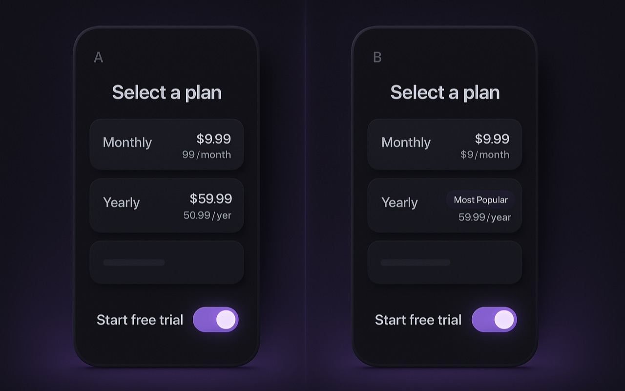
Design the screen: options, anchoring, and proof
Once timing is right, the layout itself is a set of small, testable levers. Keep choices to 1–3 plans with one clearly labelled "recommended" option — the median paywall ships 2 plans. More than three options usually adds friction, not revenue.
- Anchor the price. Show regular vs current price, the monthly-equivalent of the annual ("just $3.25/mo"), and a prominent discount % above the price — loss aversion is real, and tying the discount to a reason makes it land.
- Lead with social proof. Reviews and impact stats near the top of the paywall, not buried below the buttons.
- Simplify the copy. Benefit clarity beats cleverness; this is one of the most consistent winners RevenueCat reports.
- Add a free-trial toggle. A "free trial enabled" switch makes the trial feel risk-free and is a recurring redesign winner — see free-trial conversion for the trial-side tactics.
Layered tactics: animation, structure, and personalization
These compound on top of a clean base paywall. Per RevenueCat’s conversion-booster guide and Superwall’s 2025 trend reports, three structural moves stand out.
Purposeful animation
A pulsing CTA or entrance effect is cited at a 12–18% lift versus a static screen. Purposeful, not decorative — it guides the eye to the action.
Multi-page paywalls
Spreading the offer across screens is a 2025 Superwall trend driving ARPU gains: each page does one job (value, proof, plan choice) instead of one crowded screen.
Personalization
Segmenting the paywall by onboarding answers beats a generic one by ~15%+ (Superwall). The onboarding survey that personalizes the paywall is doing double duty.
Use urgency judiciously — a real, time-bound offer can help, but permanent "limited time" banners erode trust and stop working. Reserve urgency for genuine events and win-back moments.
Proven redesigns: what moved the number
The case studies below come from RevenueCat’s paywall-redesign write-ups. They are useful precisely because they pair a tactic with a measured outcome — but note they measure different metrics (conversion, ARPU, install-to-trial, revenue), so compare them to your own funnel stage, not to each other.
| App type | Result | Metric |
|---|---|---|
| Crypto | 2.7% → 3.24% (+20%) | Paywall conversion |
| Driver’s-license prep | +17% | ARPU |
| Party game | +31% / +64% | Install-to-trial / revenue |
| Food | +72% | Install-to-trial |
A disciplined A/B testing cadence
The stores will not natively show different prices to different users for the same product, so paywall and price tests run by creating separate offerings (variants) and splitting traffic — the model RevenueCat, Adapty, and Superwall all use. Discipline matters more than any single idea: the apps that experiment heavily earn on the order of 40× more than those that do not.
- Change one lever at a time — placement, plan count, the anchor, animation, copy, or personalization — so you can attribute the result.
- Measure the full lifecycle, not just initial tap-through: a flashier paywall that draws lower-intent buyers can lower lifetime value. LTV is the decision metric.
- Run each test long enough to see renewals (often 4–8 weeks) and keep clean, normalized data so the call is trustworthy.
Paywall optimization is one piece of a larger system. Pair it with subscription pricing strategy for the plans the paywall presents, and with the broader revenue playbook for placement, trials, churn, and experimentation in one funnel. The full index lives in the Playbook hub.
Where personalized pricing fits
Once your paywall design, placement, and offer structure are solid, the next frontier is personalization — moving past one list price toward what each user is actually willing to pay. Because the stores forbid arbitrary per-user prices, this is done through eligibility-aware offers and discounts, not raw price changes. That is the layer Monetai operates in: it predicts each user’s purchase intent and serves a personalized discount only to those who likely need one — designed to focus discounts there rather than on people who would have paid full price, with impact validated via A/B testing. It sits on top of whatever paywall you already ship — an optimization layer, not a replacement for it.
Curious where your prices land against the market? Browse live app pricing benchmarks from App Pricing Lab’s daily crawl of 135,000+ apps.